Christine Komatsu
About
Rosetta Stone · 2018
Winner · 2019 Best Made for Samsung App Award

Rosetta had ~85% brand recognition in the US. In South Korea, no one had heard of them.

Role: Lead designer. Team: Product Owner, Project Manager, Developer, Strategist.

2019 Best Made for Samsung App Award

Presented at the Samsung Developer Conference, recognizing the app across five criteria: platform optimization, user experience and quality, innovation and feature set, relevance to Samsung users, and ecosystem integration.

Four mobile screens from the Rosetta Stone 1:1 English Tutoring app on the Korean Google Play Store. Left to right: a date and time selection flow with available session slots, a conversation topic view with discussion prompts and imagery, a live session screen with the tutor's face and chat bubbles, and a post-session feedback view with vocabulary and notes from the tutor.

Korean launch · session ratings and booking analytics. New product, no pre-launch baseline.

73%
Of sessions were rated 5 stars.
42%
Of learners booked more than one session.
55%
Of sessions were booked for the next day.

The problem

English language learning was a $33.5 billion global market in 2018, and Asia-Pacific made up about half of it. It was also where Rosetta had the least presence.

Rosetta Stone's existing offering was shaped around the hobbyist, but career-minded learners made up almost twice the market share of casual hobbyists.

I led design on a cross-functional tiger team with a six-month mandate: validate whether 1:1 mobile tutoring was the right path forward, and if so, shape what that product should be for both learners and tutors. After the design sprint, the PM and I built it out for the rest of the six months.

Industry estimates, 2018

How I framed it

I capped the interviews at seven with learners across APAC. The PM and I were doing the recruiting and screening, and timezones made every step slow. Going for more would have meant rushing each one. Two findings came up consistently.

What learners told us
  • Tutoring Over e-learning
  • Private sessions Over group sessions

Why those preferences came up

Partner interviews in China and Korea showed why learners wanted tutoring over e-learning. Students are taught English from K-12 but rarely get to practice speaking, because native English-speaking tutors are expensive.

Take Soojung Park, 34, a marketing manager at Hyundai. Career-minded and proficient in English, she rarely felt confident speaking. Every learner I interviewed had the same fear: being wrong in front of an audience.

Group sessions triggered the same fear

We tested two concepts: a group-session "Master Class" led by business leaders, and a private "Find a Tutor" for 1:1 tutoring.

Group sessions triggered the same hesitation we'd already heard in interviews. The shame of getting something wrong in front of others was a big source of anxiety that mattered more than the content quality.

Two concepts tested
Concept A
Master Class

Group sessions led by business leaders.

Concept B
Find a Tutor

Private 1:1 tutoring.

Won

Two decisions

The receipt

Feedback was the differentiator

After the confidence insight, I went looking for where the design could give learners something concrete to take with them. The post-session moment was the obvious place.

In session, learners juggled three things: chat, participation, and notes. Note-taking was the most burdensome of the three. Ironically, it was also what pulled them away from listening to the tutor, and they were paying for that listening time.

Note-taking was getting in the way of listening, so I designed the feedback feature to cover that work instead. I tested five variations across multiple rounds of 1:1 interviews with learners in Korea, iterating between rounds.

Five variations tested
V1 Mobile screen titled Feedback, shown during an active call with the tutor. A bullet list shows pronunciation items and practice instructions. Mute and End call buttons sit at the bottom.
V2 Mobile Messages screen with a message from tutor Mark. The body opens with Hello Joon, Nice job, and praises pronunciation improvement on f and w sounds and fluency in the Read Aloud section. A Lets go button starts the next lesson.
V3 Mobile Inbox screen with a message from tutor Mark. Below the message, sections labeled Pronunciation and Usage list practice phrases with audio playback buttons.
V4 Mobile screen titled Your monthly report. A summary block shows hours in tutor sessions, hours in e-learning, and e-learning accuracy. A progress block lists tutoring sessions, new vocabulary words, new phrases, and training plans. Below, average scores from tutoring sessions show star ratings for Vocabulary, Pronunciation, and Grammar.
V5 · Winner Mobile Notes screen showing scores for Vocabulary, Pronunciation, Fluency, and Listening. Below, a personal note from the tutor opens with Hi Mary, praises listening, and highlights areas to work on. Sections follow for What we covered, Things to work on, and Vocabulary.

Learners wanted feedback that reflected measurable progress; they told me they were paying for progress, not praise.

"Encouragement is good, but what's more important is that we need to learn something."

Learner interview

V5 won because it gave learners both quantitative and qualitative feedback. They got scores for how they did, plus a tutor's note and recap for what to improve. The vocabulary that came up in session was bonus material they hadn't paid extra for. Learners started calling it the receipt, and one said it felt like getting something for free on top of the session itself.

Tutor portal

The other half of the product

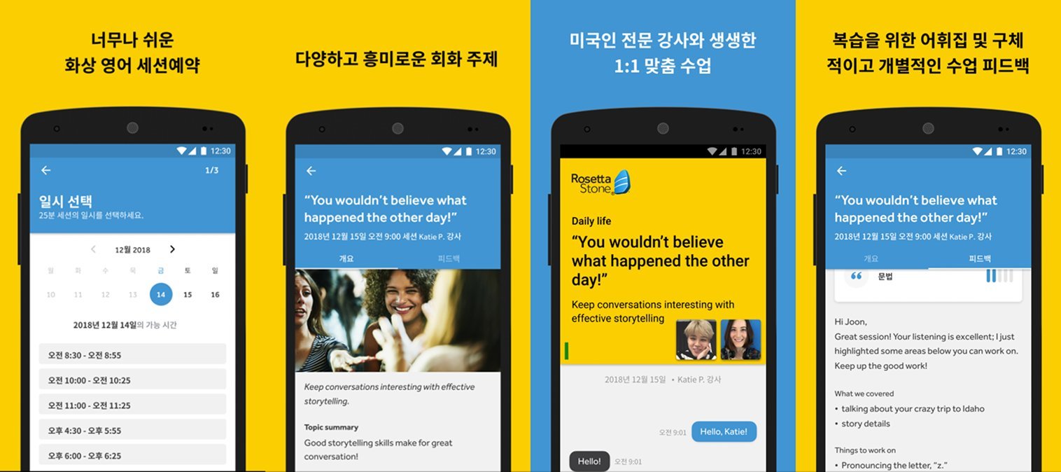
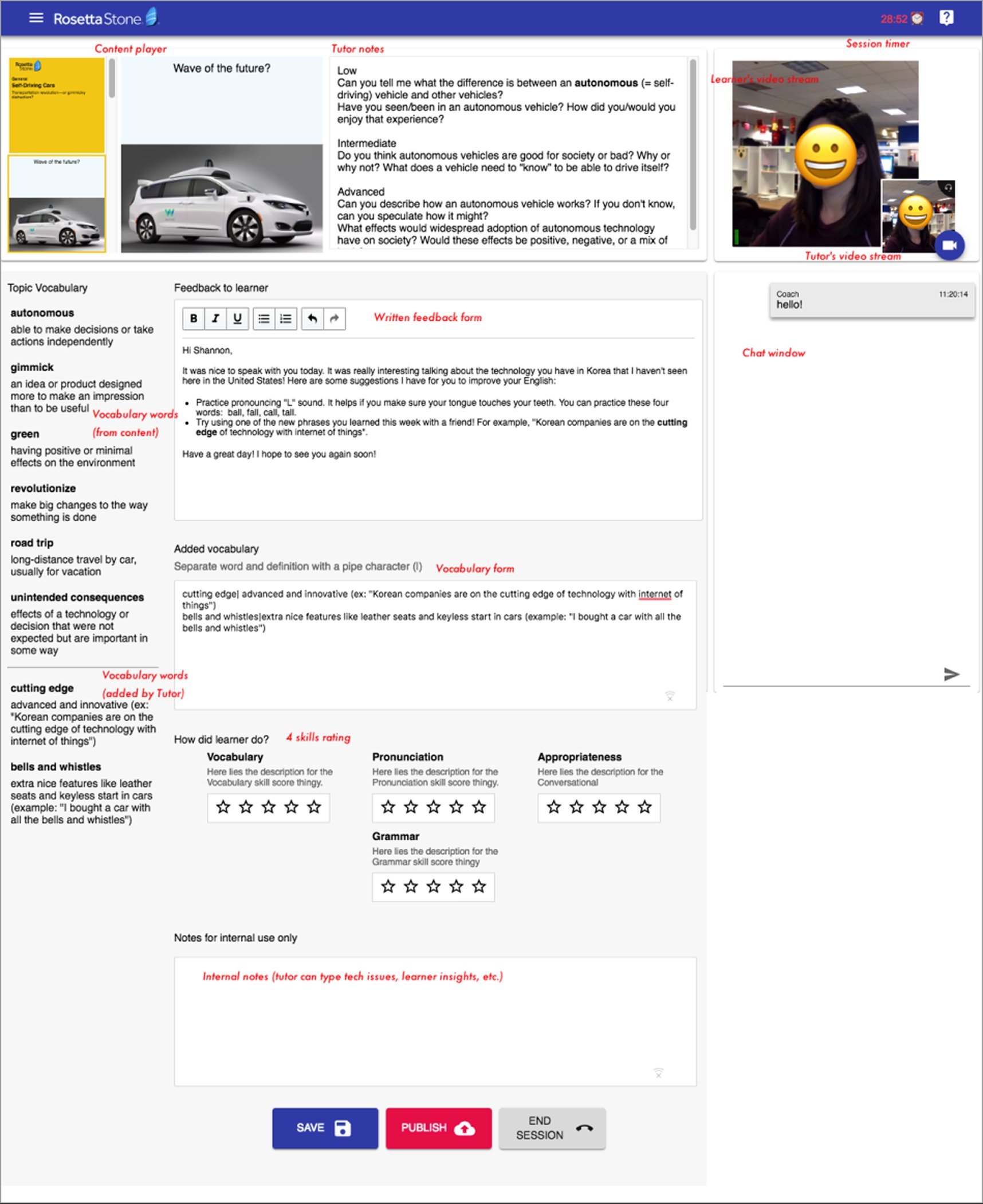
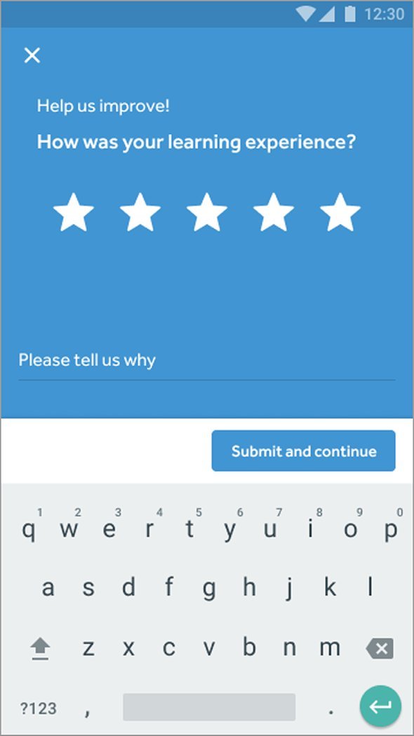
The feedback feature only worked because the tutor portal made it possible in five minutes. That portal was its own design problem.

Tutors had to teach, maintain eye contact with the camera, navigate slides, manage chat, add vocabulary, and rate learner performance across multiple competencies, all at once.

One tutor said:

"We only have 5 minutes between sessions, so it's stressful."

Tutor interview

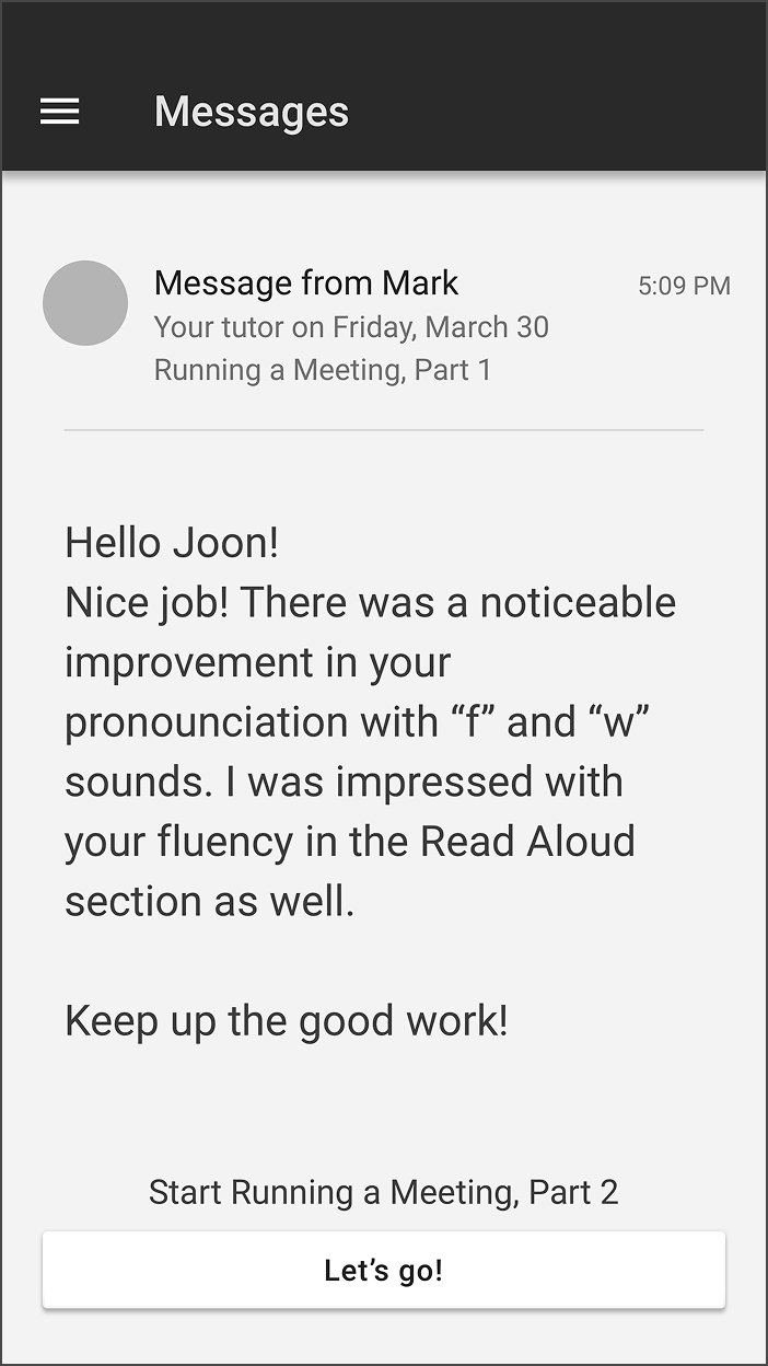
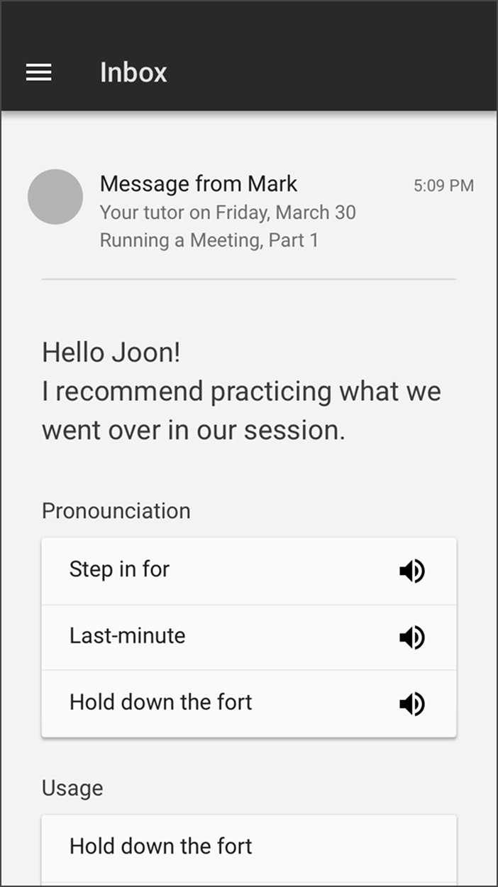
Tutors had five minutes between sessions to leave feedback, wrap up notes, and prep for the next learner. That constraint shaped two specific design moves:

  1. The vocabulary section uses a keyboard shortcut: type a word, hit |, type the definition, and the output formats automatically with the term in bold.
  2. An internal notes section, visible only to tutors, lets one tutor hand off context to the next so the first five minutes of any session aren't burned on introductions.
Annotated mockup of the Rosetta Stone tutor portal, showing the content player on the left, tutor notes and feedback form in the center, learner and tutor video streams and a chat window on the right, a vocabulary section pulled from the content plus tutor-added vocabulary, a four-skill rating area (Vocabulary, Pronunciation, Grammar, Appropriateness), and an internal notes section at the bottom. Action buttons labeled Save, Publish, and End Session sit at the base of the screen.

Attention to detail

Edge cases are where I worked closest with engineering. Here are six moments where the design supported learners so they didn't run into a dead end.

Edge case 01

A dead end becomes a feedback loop

When no sessions are available, learners can enter their preferred booking time, and that data feeds tutor availability decisions in Korea.

Mobile screen titled Select a day and time, step 1 of 3. December calendar with Saturday the 15th selected. Below, Available times for Sept 1, 2018 shows a pale-blue banner reading No sessions found. Please choose a different day. A link at the bottom reads I don't see a time I want.
Edge case 02

Catching conflicts before they become frustrations

A clear modal flags scheduling conflicts the moment they happen, before the learner commits and has to back out.

Mobile modal titled Double-booked session. Body reads: Looks like you have an upcoming session booked in that time slot. Try finding a different time slot that works for you. An OK button sits at the bottom right.
Edge case 03

A graceful fallback when a time isn't available

Instead of a hard no, learners send the time they wanted and stay in the flow. The data goes back to us as a signal for capacity planning.

Mobile screen with a blue header reading We're sorry the time you want isn't available, and a subhead asking What time did you want on Dec 15, 2018. Below, a time picker shows 1:30 PM selected. A Send feedback button sits at the bottom.
Edge case 04

Managing the anxiety of the in-between

For learners who carved out rare time inside a 52-hour work week, the wait for a tutor to connect is the most anxious moment. A chat thread and a clear status reduce the uncertainty.

Mobile screen with a dark banner at top reading Waiting for your tutor to connect. A warning triangle sits in the center of a gray canvas. A small learner video thumbnail is in the bottom right. Below the canvas: Friday, August 31, with Shannon. A chat thread shows the learner saying Hello, Shannon at 9:01 AM and Shannon replying Hello at 9:01 AM.
Edge case 05

Mic and video verified before the session

Permissions checked before the clock starts, so technical issues don't eat into learning time.

Mobile onboarding screen titled Mic and video check. An illustration shows a tutor at a whiteboard overlapping with a smartphone displaying a microphone icon, set against pale blobs of yellow and blue. Body text reads: Get started by allowing permissions for audio and video. Audio permissions are required to join your session. A Got it button sits at the bottom.
Edge case 06

Tech quality and learning quality, kept separate

Two prompts instead of one, so a bad connection doesn't get conflated with a bad lesson. The distinction matters for how the data gets used downstream.

Mobile post-session feedback prompt on a blue canvas. Header reads Help us improve. Large headline asks: How was the sound and video quality of your session? Two circular buttons below: thumbs up and thumbs down. A Submit and continue button sits at the bottom. Second mobile post-session feedback prompt on a blue canvas. Header reads Help us improve. Subhead asks: How was your learning experience, with a five-star rating row below. A Please tell us why text field follows, and a Submit and continue button sits at the bottom.

What I learned

The seven interviews changed what I thought we were building. Going in, I thought learners wanted more teaching: better tutors, more native speakers. That's what every tutoring app already focused on. They actually wanted confidence. Without it, they wouldn't speak in real conversations, and without that, they couldn't actually get better.

The interviews worked because we let learners tell stories. They'd walk me through specific moments they wanted to speak but didn't. I'd say “tell me more,” and they'd tell me.