Christine Komatsu
About
CareRev · 2023

CareRev became customers' scheduling help desk, handling changes health systems should have been able to manage themselves.

I designed a workflow flexible enough to handle the scale and complexity of how each health system manages staffing.

Redesigned CareRev shift schedule showing a filterable, sortable table with multi-select checkboxes. 25 shifts are selected, with a 'Cancel shifts' action surfaced above the table. The left sidebar shows filter controls including facilities, units, date range shortcuts, and start time.

"What is the timing on bulk cancels? Can we give our customer beta access when it's ready?"

VP of Strategic Accounts, CareRev

Leadership was already thinking about who'd get it first.

Tracked by the CSM team and product manager. Pre-launch baseline (prior 3 months) vs early post-launch.

60%
Fewer support calls
30%
CSAT increase
20%
Faster task completion

The problem

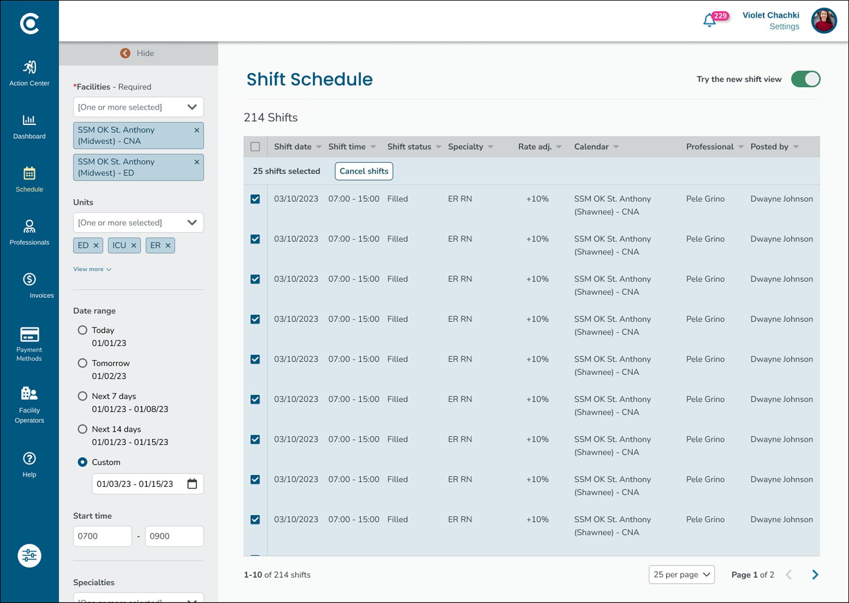
Our largest health system customers needed to cancel hundreds of nursing shifts at a time, but the tool only let them do it one by one.

Four things were broken about the existing workflow:

  1. No way to filterThere was no way to filter shifts beyond the facility name. Finding the right ones took longer than it should have.
  2. One at a timeEvery shift had to be cancelled individually, with at least five steps to complete.
  3. Weak sense of placeClicking into a shift opened a new window, pulling users away from the page they were working on and leaving them disoriented.
  4. No confirmationAfter all of that, there was no signal that anything had actually gone through. Every cancellation felt like a leap of faith.

The goal

Three things the redesign needed to do.

Ownership Customers cancel shifts on their own. CareRev stops being the help desk.
Speed Cancel hundreds of shifts at a time.
Confidence Show cancellation fees and risks before anything goes through, so customers know what they're committing to.

How I framed it

Context

A few customers shaped the product

CareRev's business depended on a few large health systems. The company kept them happy by building what they asked for, when they asked for it. After enough rounds, the product was a stack of one-off features that didn't fit together for anyone, but the team rarely pushed back.

Workflow

The redesign started with two diagrams

I drew two diagrams of the workflow: the existing flow, and what it needed to be. Both shaped the design.

Existing workflow Existing workflow showing five sequential steps and their pain points: scan calendars (high cognitive load), open a new page (weak sense of place), cancel in modal (friction), no confirmation (low confidence), verify by hand (friction).
Expected workflow Expected workflow showing five sequential steps and their benefits: narrow the list (low cognitive load), select multiple (scalability), see selections (reassurance), confirm intent (ownership), success feedback (confidence).
Witnesses

Three witnesses pointed to the same diagnosis

"I had to cancel 800 shifts one-by-one. I had to drop what I was doing because it was a time-sensitive task."

Customer Success Manager

We were the help desk.

Two directors with different vantage points heard the same thing.

"They don't see us as a partner, they see us as a vendor."

Director of Strategic Accounts

"Staffers don't want to go through five different pages to make changes and hover a million times to find and compare shift info."

Director of Implementation

Staffers needed to handle their own scheduling. CareRev gets to show up as a partner, and staffers get their time back.

Survey

Sprig data told a different story

I ran an in-app Sprig survey on the existing flow.

  • 48% of staffers said the task was easy.
  • Only 26% said it was difficult.
Screenshot of the CareRev shift schedule with an overlaid Sprig survey asking 'How easy is it to find the shift information you need?', showing 49 responses with a 3.4 average rating, distributed across the 1-5 scale.
In-app Sprig survey, triggered after shift cancellations. 49 responses, 3.4 average.

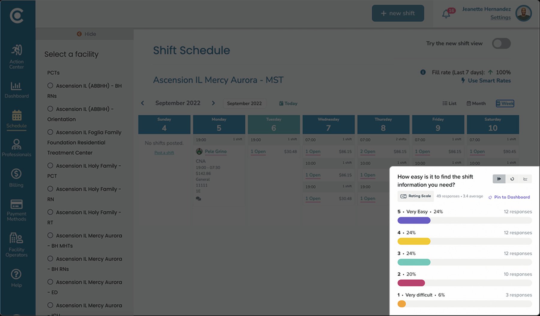
The numbers didn't match what I was hearing in conversations, so I brought them to the Director:

"Once you get used to it, it's super easy."

Director of Implementation
What she meant

Super easy ≠ optimal UX.

Super easy = I've become used to navigating this broken system.

The approach

Every health system ran staffing differently.

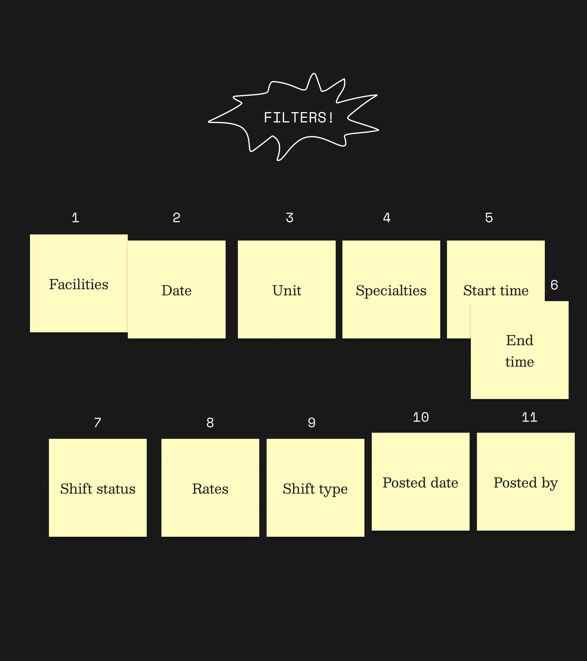
Group sessions with stakeholders told me filters were the biggest variance. They had requested 11. We sorted and prioritized them together, and shipped the top four in v1.

Unsorted Eleven yellow sticky notes scattered on a dark background under a starburst labeled FILTERS!. Notes read: Facilities, Shift status, Rates, Specialties, Posted date, Shift type, Start time, End time, Date, Unit, Posted by.
Sorted by stakeholders The same eleven sticky notes organized in two rows in priority order. Top row, items 1 through 6: Facilities, Date, Unit, Specialties, Start time, End time. Bottom row, items 7 through 11: Shift status, Rates, Shift type, Posted date, Posted by.

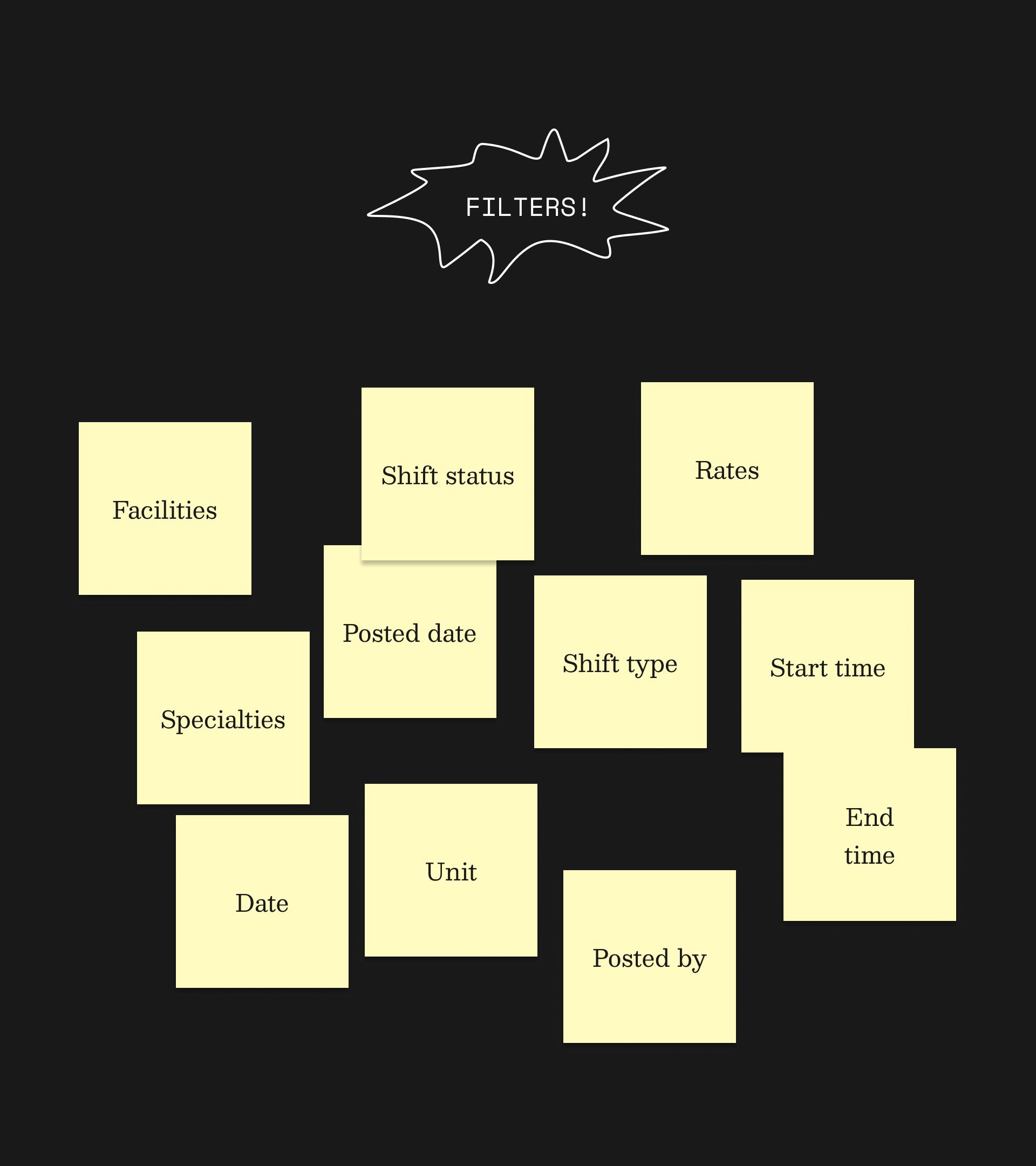
By the end of my working session, stakeholders were bringing in their own ideas: task-specific filter combinations and automated CSV reports. Both were planned for later versions.

Three decisions that mattered

One view, built for the task

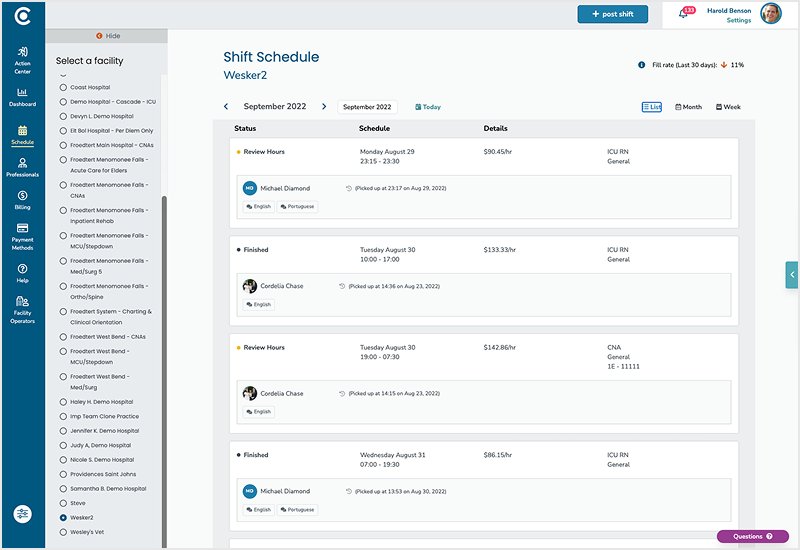
Hospital staffers and nurses were both navigating calendar views despite having two fundamentally different jobs: nurses browse, staffers execute. They need to find shifts and cancel them, fast.

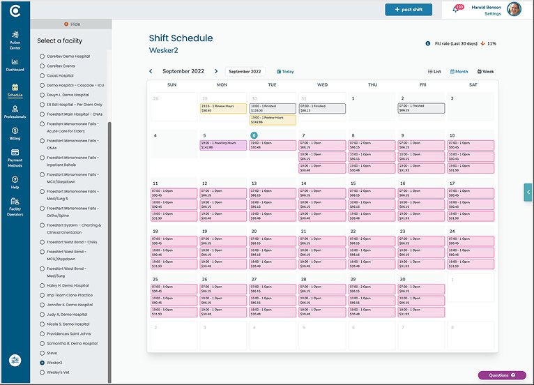
Each calendar view surfaced only a fraction of the shift details staffers needed, and clicking into a shift meant leaving the page entirely. I collapsed the three views into one.

List Original CareRev shift schedule list view showing shifts grouped by status, with details on the right side.
Week Original CareRev shift schedule week view showing seven daily columns with shift counts and openings.
Month Original CareRev shift schedule month view showing a calendar grid with shift counts in each day cell.
Each surfaced a fraction of what staffers needed.
Redesigned CareRev shift schedule showing a filterable, sortable table with multi-select checkboxes. 25 shifts are selected, with a 'Cancel shifts' action surfaced above the table. The left sidebar shows filter controls including facilities, units, date range shortcuts, and start time.
After: one view, built for the task. Filters on the left, multi-select inline, bulk action surfaced.

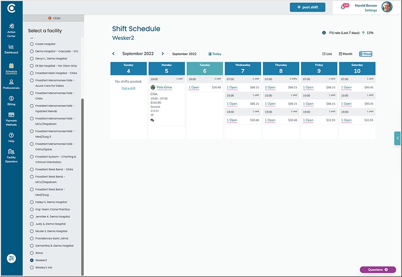
I borrowed the bulk action pattern from Gmail. Check the rows you want, and the action appears at the top of the table.

Bulk cancellation was the first action shipped, but I designed the view to handle single-shift edits and bulk edits too.

4 of the 11 filters shipped in v1

The top four shipped in v1: Facilities, Date, Unit, Specialties.

Filters that shipped in v1.
Filter sidebar showing four sections in order: Facilities (with 'All facilities' selected as a tag), Units (empty selector), a divider, Date range (radio options for Last 7 days, Last 30 days, Last 60 days; Last 7 days selected), another divider, and Specialties (with 'All specialties' selected as a tag).
Filters planned for v2.
Expanded filter sidebar with the full v2 plan: Facilities (required, with two SSM St. Anthony locations selected), Units (with ED, ICU, ER selected), Date range (Today, Tomorrow, Next 7 days, Next 14 days, Custom selected with date range), Start time (with start and end fields), Specialties (with three RN specialties selected), Rate adj. level (with 15% checked), Shift status (All selected), Shift type (All selected), Posted by (with Johanna Lim selected), and Posted date (with date range).

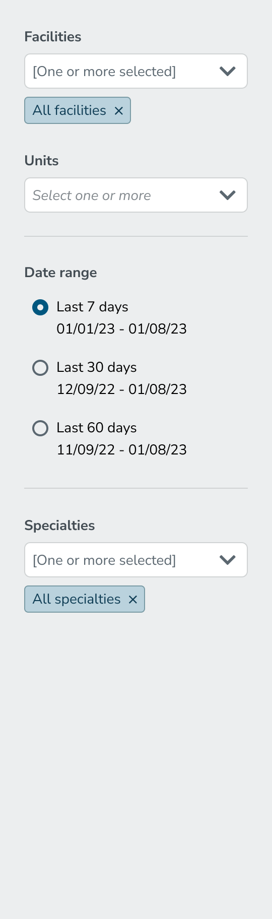
The other seven sat in the backlog, ordered by the same ranking.

I built in the windows staffers used

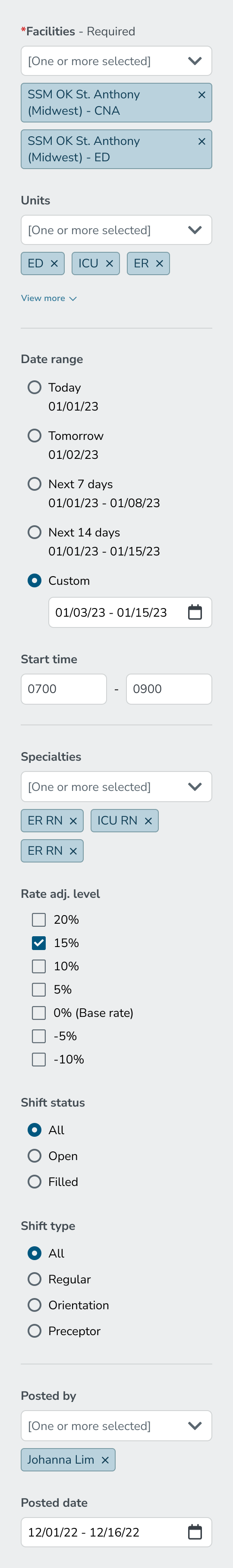
Staffers told me that canceling shifts is based on predictable operational windows: Today, Tomorrow, Next 7 Days, Next 14 Days.

Instead of a standard date picker, I designed those windows in as shortcuts.

Filter sidebar showing a Date range section with radio options: Today, Tomorrow, Next 7 days, Next 14 days, and Custom. The Custom option is selected, revealing a date-range input field below.

From support request to product demand

Instead of asking for help with bulk shift cancellations, customers were asking when they'd be able to access the new tool.