Custom English course for Uber drivers
Drivers’ lack of English proficiency was the primary pain point contributing to negative customer ratings. In the Spring of 2020, I worked closely with my team to deliver a solution that increased confidence, efficacy and would gain the most positive feedback for an Uber Pro rewards offerings.
Teammates
- PM
- Curriculum designer
- Developer
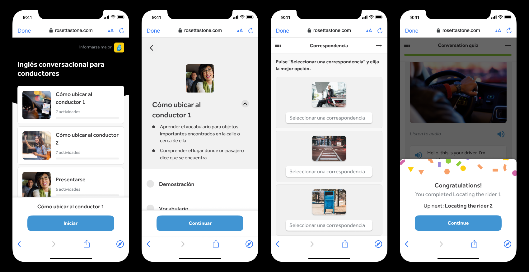 Key screens in the learner journey: (from left to right) Dashboard, lesson overview, activity, end of lesson milestone.
Re-imagining the core experience
Components from our consumer and enterprise product portfolio were leveraged to create the end-to-end course.
Dashboard

Matching activity

Lesson summary

My job was addressing the existing pain points in each of these components so customers could experience the best learning journey possible.
Success metrics
- Driver adoption rating of at least 6%
- Rider satisfaction rating of 4.4 out of 5 stars
My role
- Lead UX/UI
- In-depth interviews / user testing
- Prototyping
- Leading design reviews
- Cross-collaboration
Team members
- Project Manager
- Curriculum Designer (person who writes the course)
- Developer
Stakeholders
- Uber product team
- Rosetta Stone VP of Customer Success
High level outline
I addressed three main customer pain points:
- High friction path into the course
- Learners don’t know how to complete the activities
- Learner drop-off often happening after a single lesson

Pain point #1
High friction path into the course
For many learners, starting the course was the first obstacle. Learners expected to see a guided course that walked them through each step. Instead, they were prompted to choose a path with little context or direction.

More guidance, less friction
To better meet learner expectations, I explored ideas that minimized analysis paralysis by making the recommended path a focal point. This took the pressure off learners so they could spend less time on the Dashboard and more time in the course, learning.
7 of 7 learners intuitively understood how to begin the course.


Examining the Dashboard content
The purpose of the Dashboard is to provide a snapshot of learner progress and usher learners into starting a lesson. The lesson cards details distracted learners from this purpose.

Collapsed view
Expanded view
Intentional content framing
I listed the card contents and found most to be redundant, especially because all details could be found when tapping into a lesson. I eliminated two-thirds of the info.

Explorations
I explored ways to simplify and communicate progress at a glance.


Usability testing
- 7 of 7 learners understood the Passed state
- 5 of 7 learners understood the Failed state.
- 7 of 7 learners understood the In progress state.
- 7 of 7 learners understood the Not started state.


Roadblocks
We hit some roadblocks during the course of this project due to the pandemic. One of the biggest hurdles was sourcing users for testing. This was provided by Uber but because of major layoffs, it got delayed.
I reached out to personal contacts to get feedback and help validate ideas for a quicker turnaround. This helped ensure we stayed on track and met deadlines.
Pain point #2
Learners don’t know how to complete the activities
Learners expected the activity to be a drag and drop interaction only to find after several failed attempts, that it’s not – it is a “tap to match” activity. Often times, this caused learners to rage quit or skip the activity altogether.

Team collaboration
I shared ideas with my team and together we narrowed down solutions that were feasible, met time constraints, and aligned with the original lesson objectives.


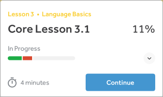
Activity results
Prompt

Options

Match selected


Pain point #3
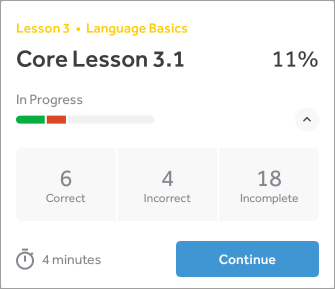
Learner drop-off often occurs at the end of a single lesson
Learners typically left the app at the end of a single lesson because it signaled the end of a milestone.


Pairing the motivational message (“Congratulations!”) with a challenge (“Up next: Locating the rider 1”) allowed learners to view the Lesson Summary screen as a cue to continue and make progress instead of a signal to quit for the day.
Using consistent visual/interaction language made the transition between the end of lesson milestone and the beginning of a new lesson seamless and fun. Learners said, “I like feeling celebrated” and “Makes me want to keep going.”
Completing the details
In Figma, I captured all paths for 5 additional activities, error states, validation, card states, localization, and iOS/Android devices.

Launch
August 2020
The custom course was a success. We exceeded our adoption and rider satisfaction goals and the received the most positive feedback for any Uber Pro reward.
