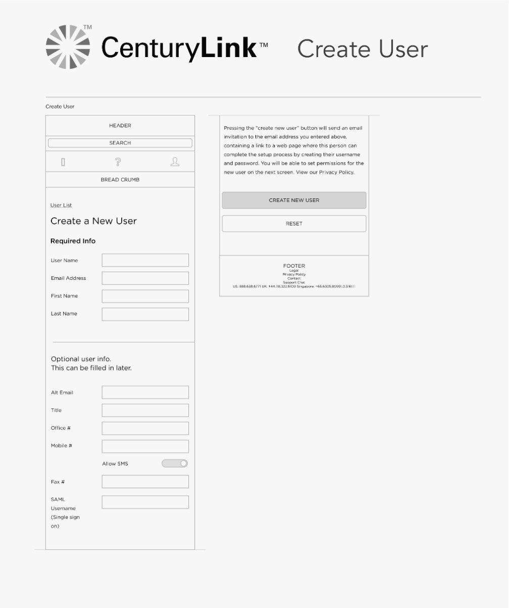
CenturyLink Cloud App
In 2016, we delivered CenturyLink Cloud’s first mobile and tablet app for their high performance, scalable cloud platform.
CenturyLink stakeholders
- CTO
- VP, Cloud Platform
- Director of Product
- Creative Director
- 2 PMs
Tech, management
- PM
- CTO/GM
- 2 Xamarin architects
Design teammates
- Creative Director
- Senior UX Designer
Objective
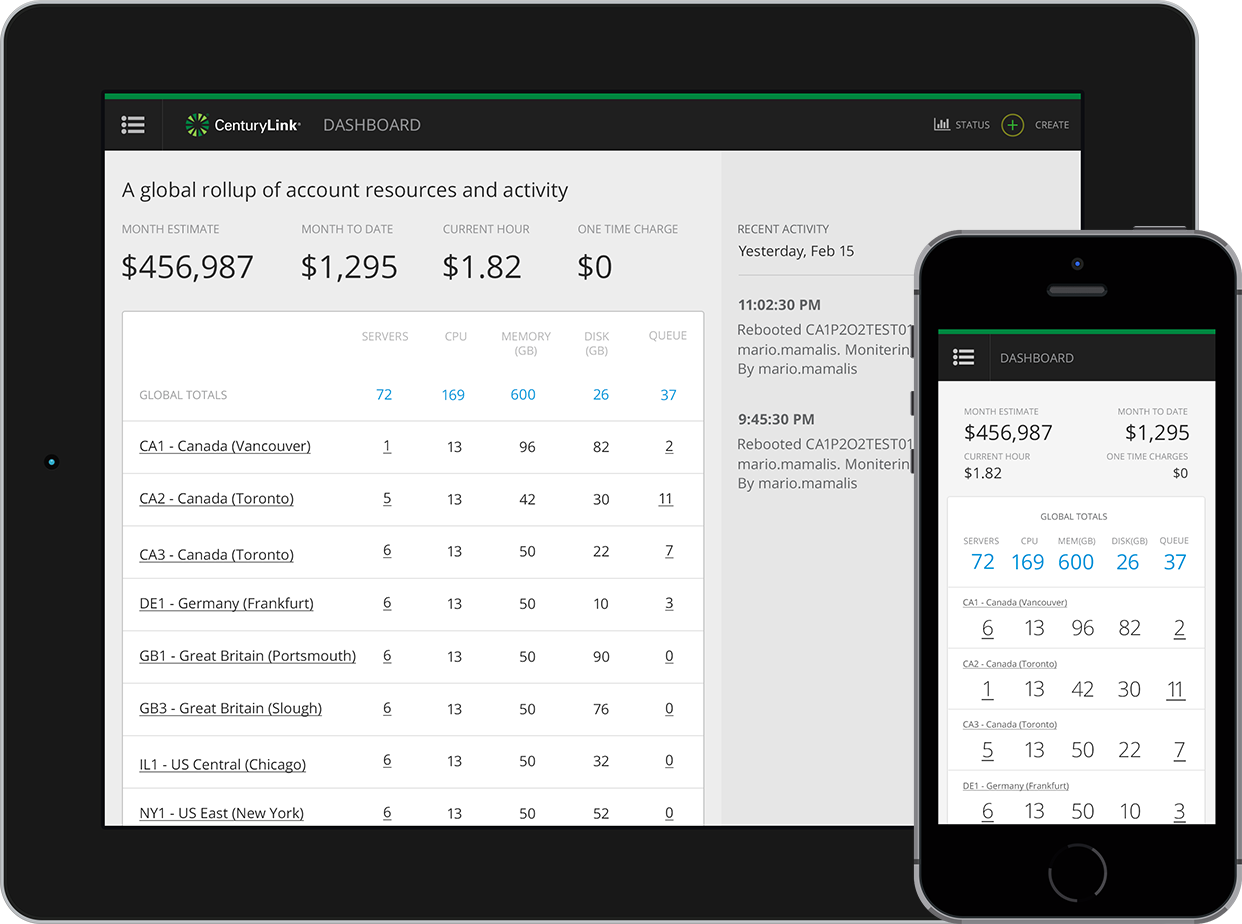
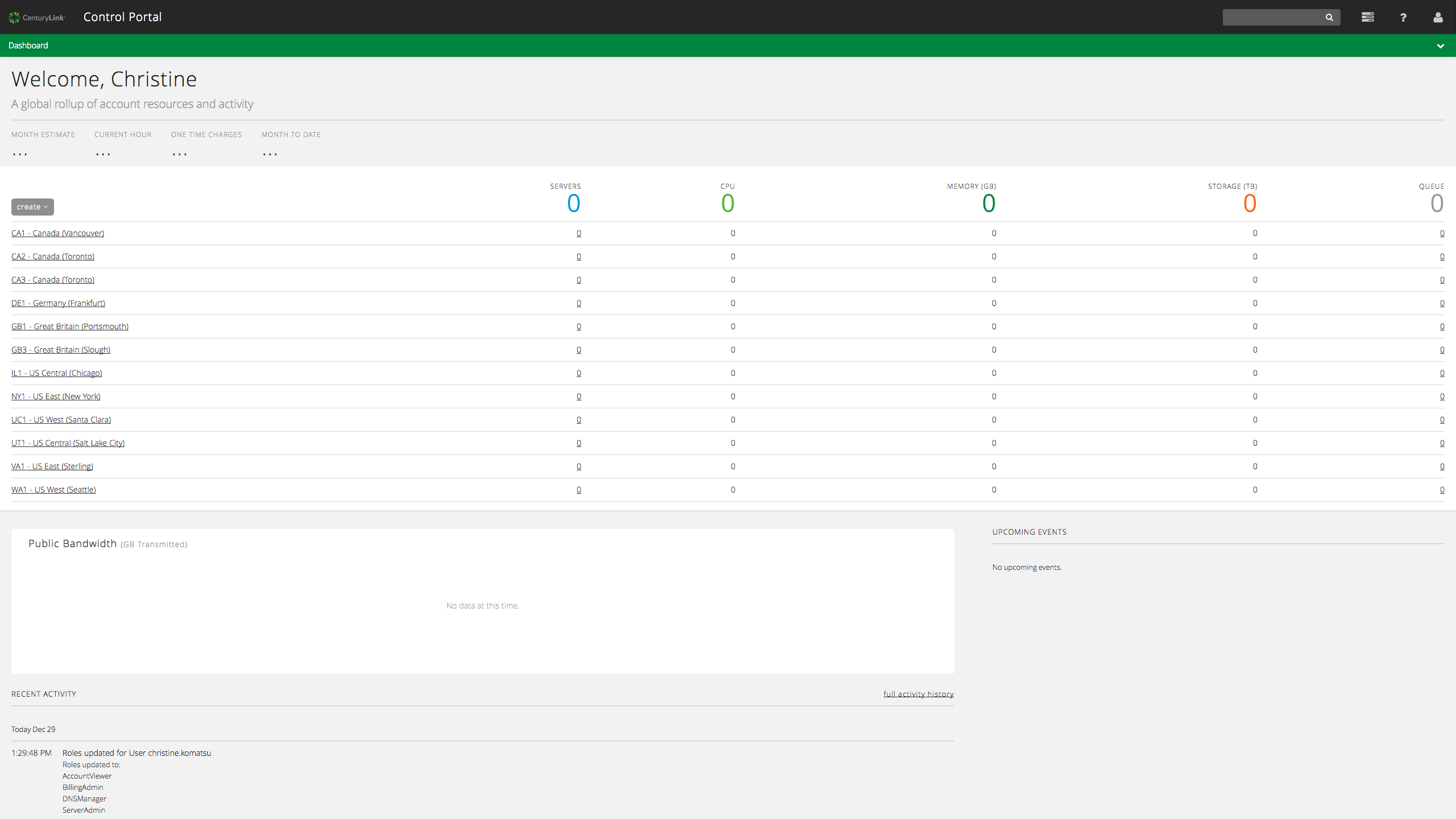
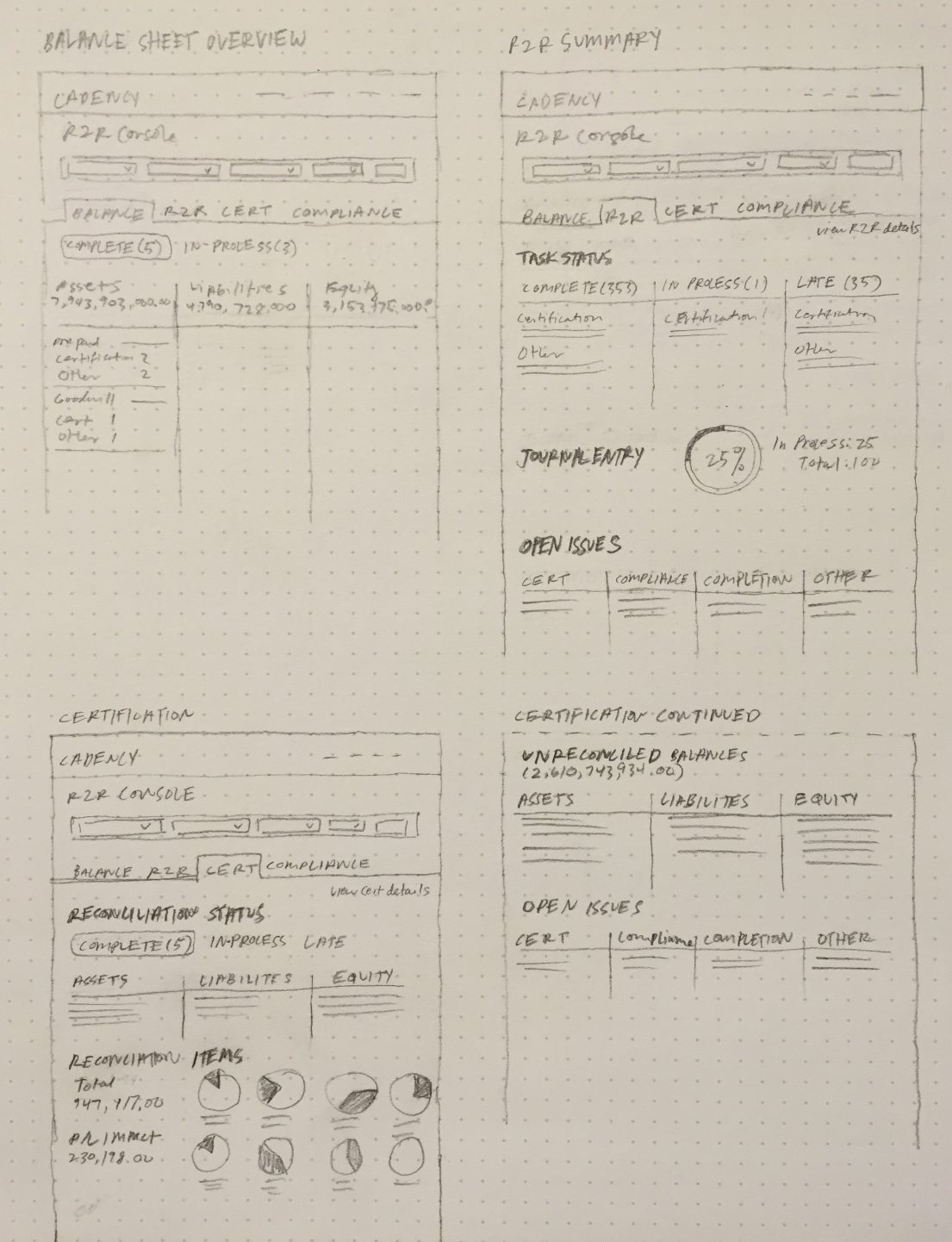
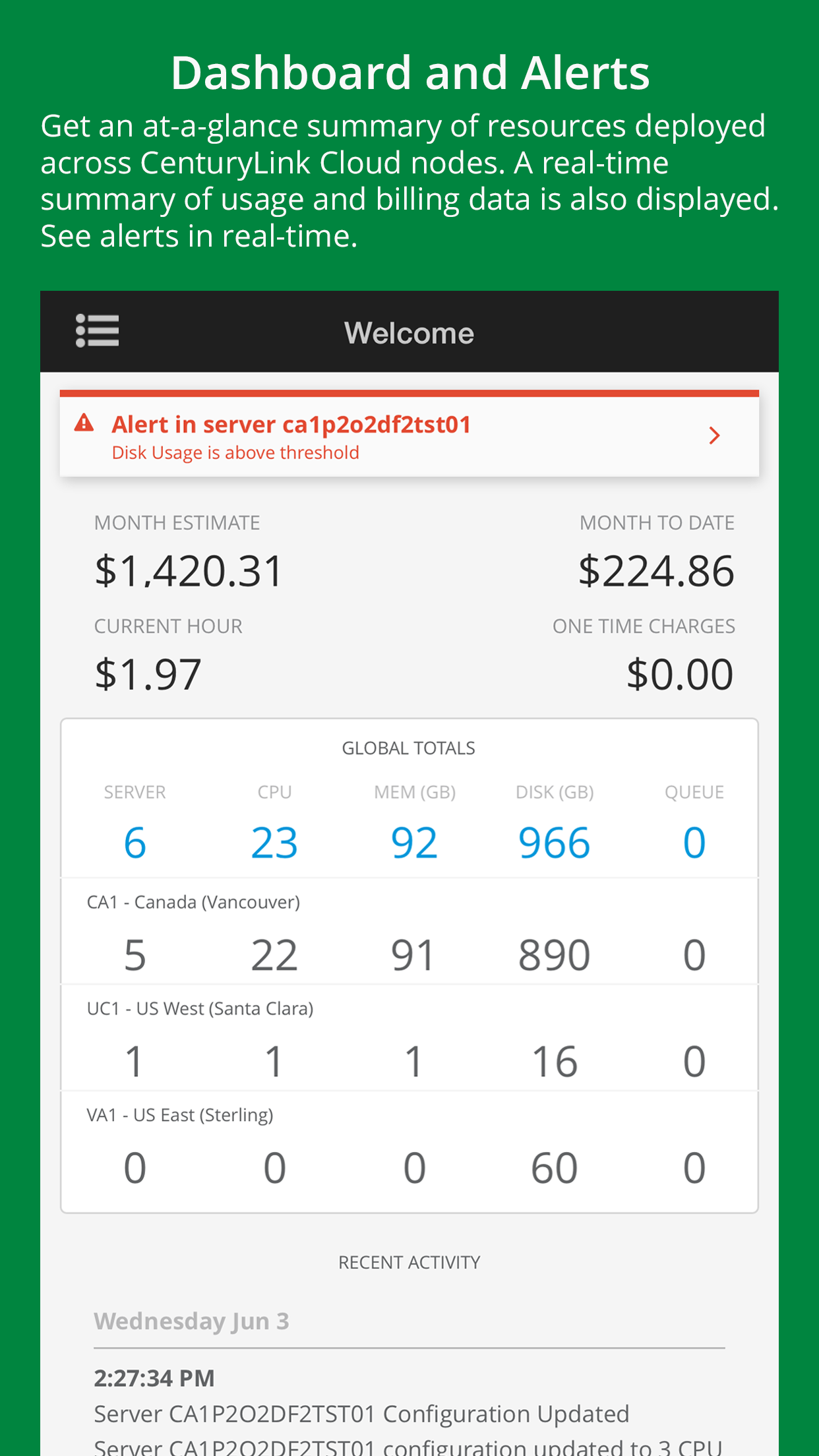
CenturyLink found that a large percentage of their traffic came from mobile devices. Our objective was optimizing the customer experience for frequent activities including viewing and managing servers, monitoring usage, and tracking billing for both mobile and tablet devices. This project spanned about six months.
Pre-emptive strike
Research was not included in the Statement of Work (SOW) so we needed to rely on what stakeholders knew about their customers and lean on best practices.

My role
I was involved in every step of the design process and worked out ideas from concepts to screen. I refined ideas through collaborative sessions with the team and client. Tasks I owned included:
- Research, info gathering
- Competitive analysis
- Information architecture
- Sketching
- Wireframing
- Whiteboarding
- Leaning on best practices
- Receiving and sharing feedback
- Collaborating
- Presenting to clients
- Delivering high-fidelity wireframes
- Redlining
Stakeholder direction

Identifying customer needs
Our stakeholders prioritized four main customer questions we needed to answer:
- How much are my servers costing me?
- How much resources are they using?
- How can I control my servers?
- How can I manage server resources?
We approached these questions by understanding the end-to-end customer journey as opposed to individual, siloed parts.
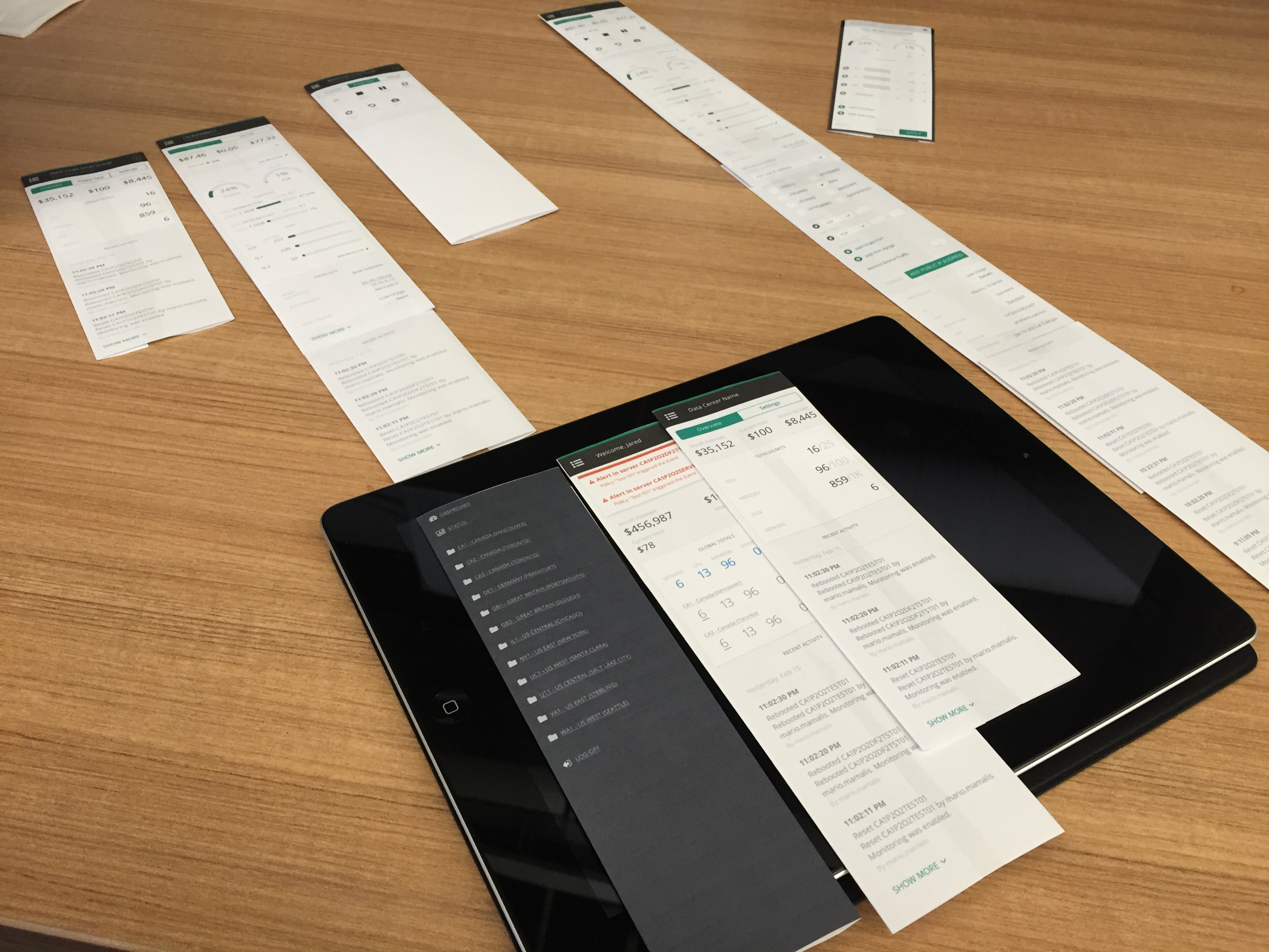
Getting familiarized with the existing web product
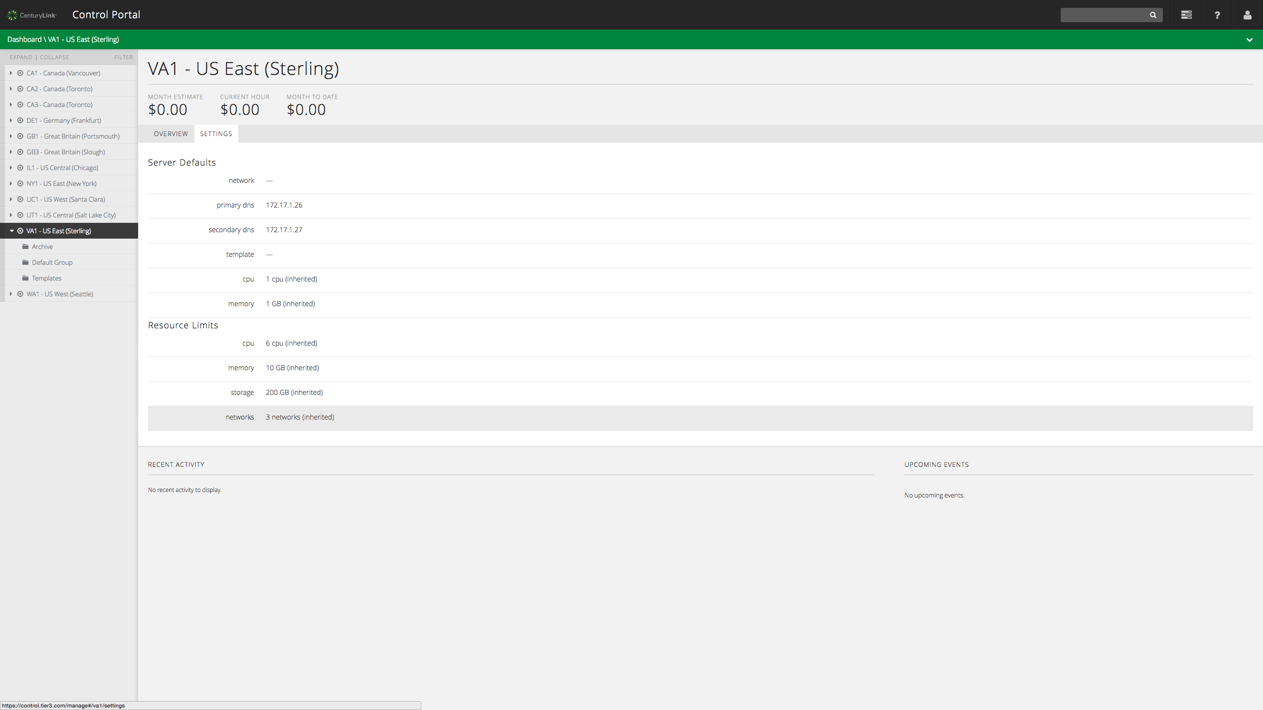
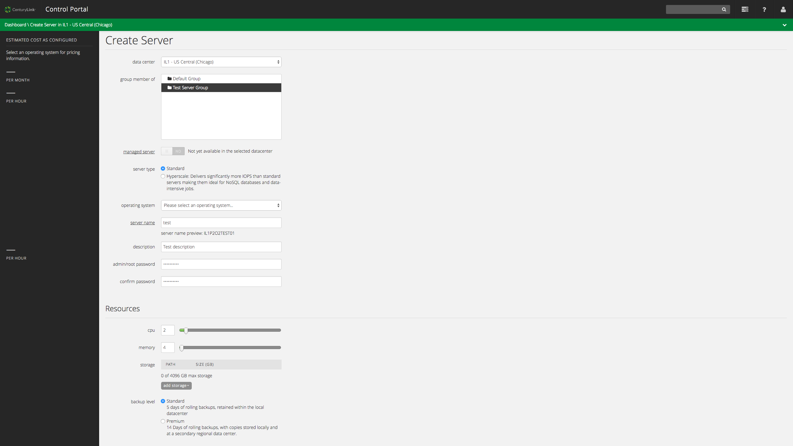
To better understand the ins and outs of the web experience, we setup test accounts and performed tasks such as creating new servers, managing server settings, and more.


Taking inventory
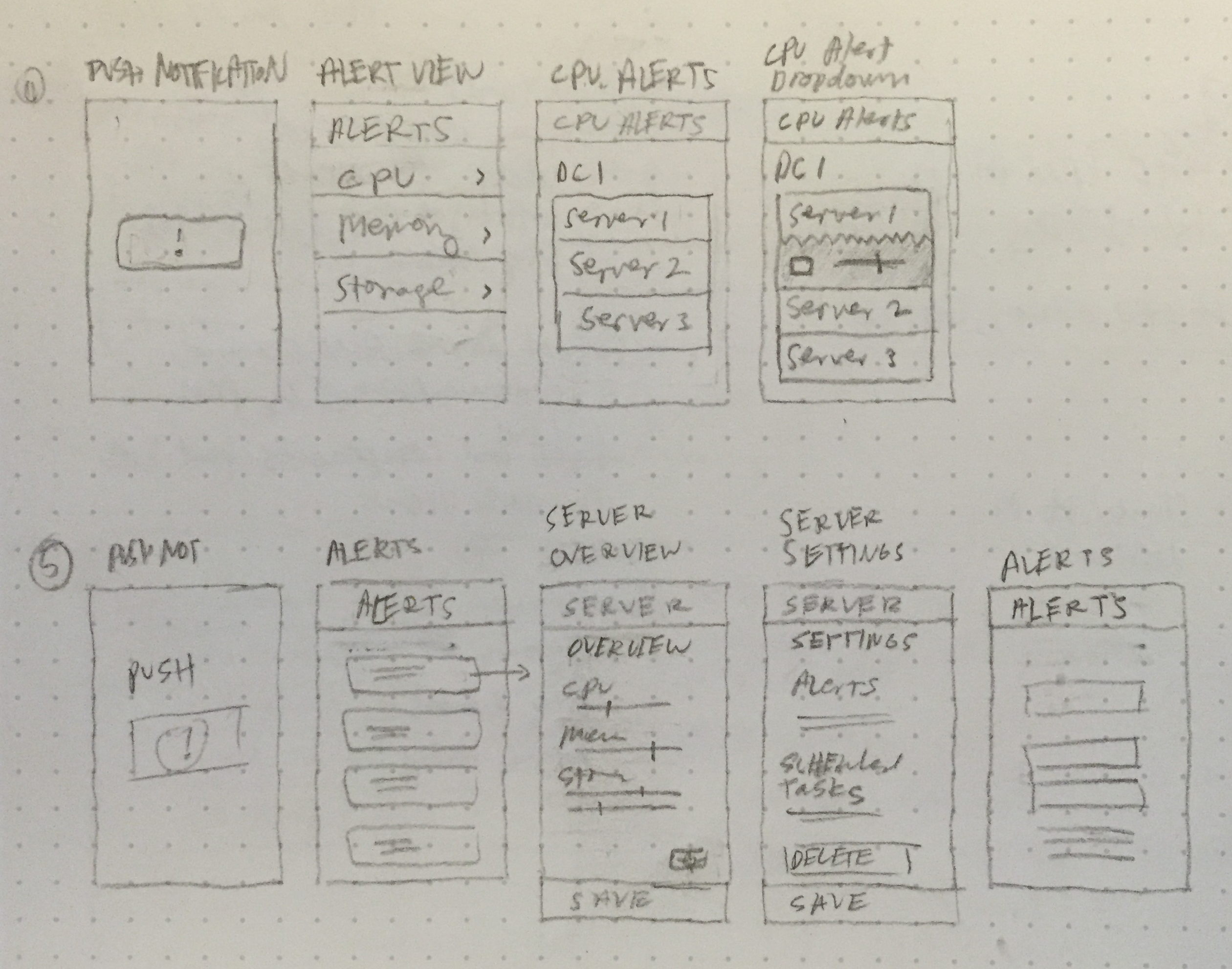
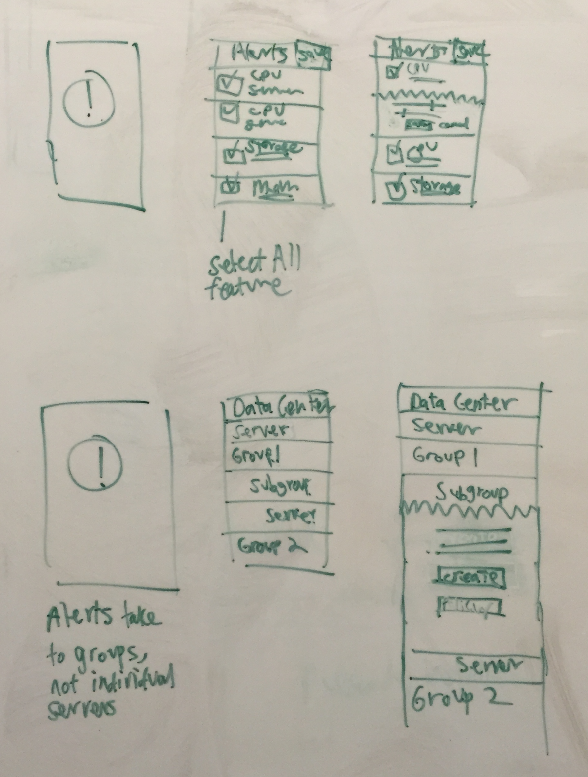
We then dug deeper and took inventory of all paths and states to help identify opportunities unique to the mobile experience. This included:
- Push notifications
- Cost estimates
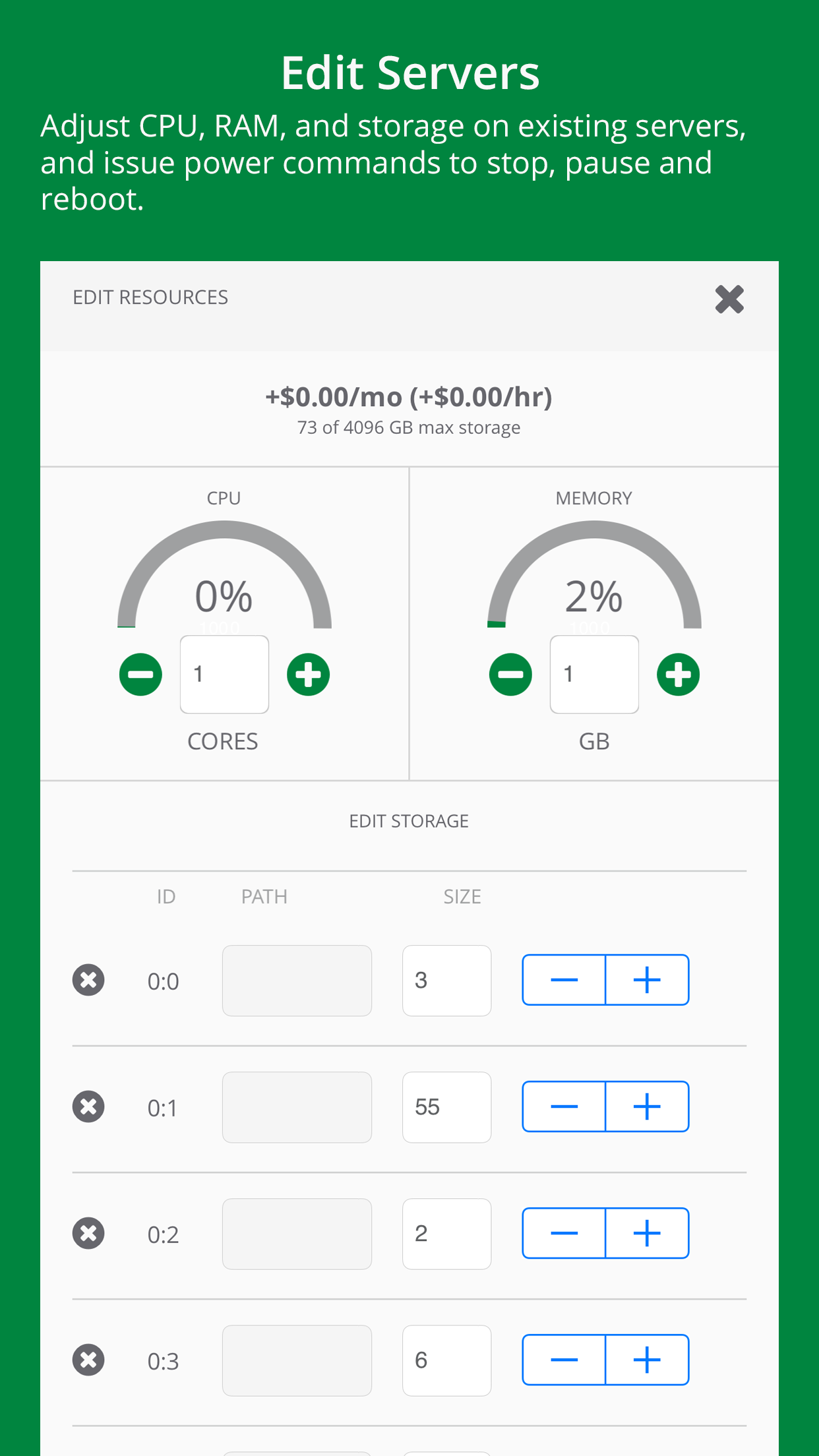
- Managing CPU, memory, disk space levels
- Server controls
- Data visualizations
- Multi-tiered navigation for data centers


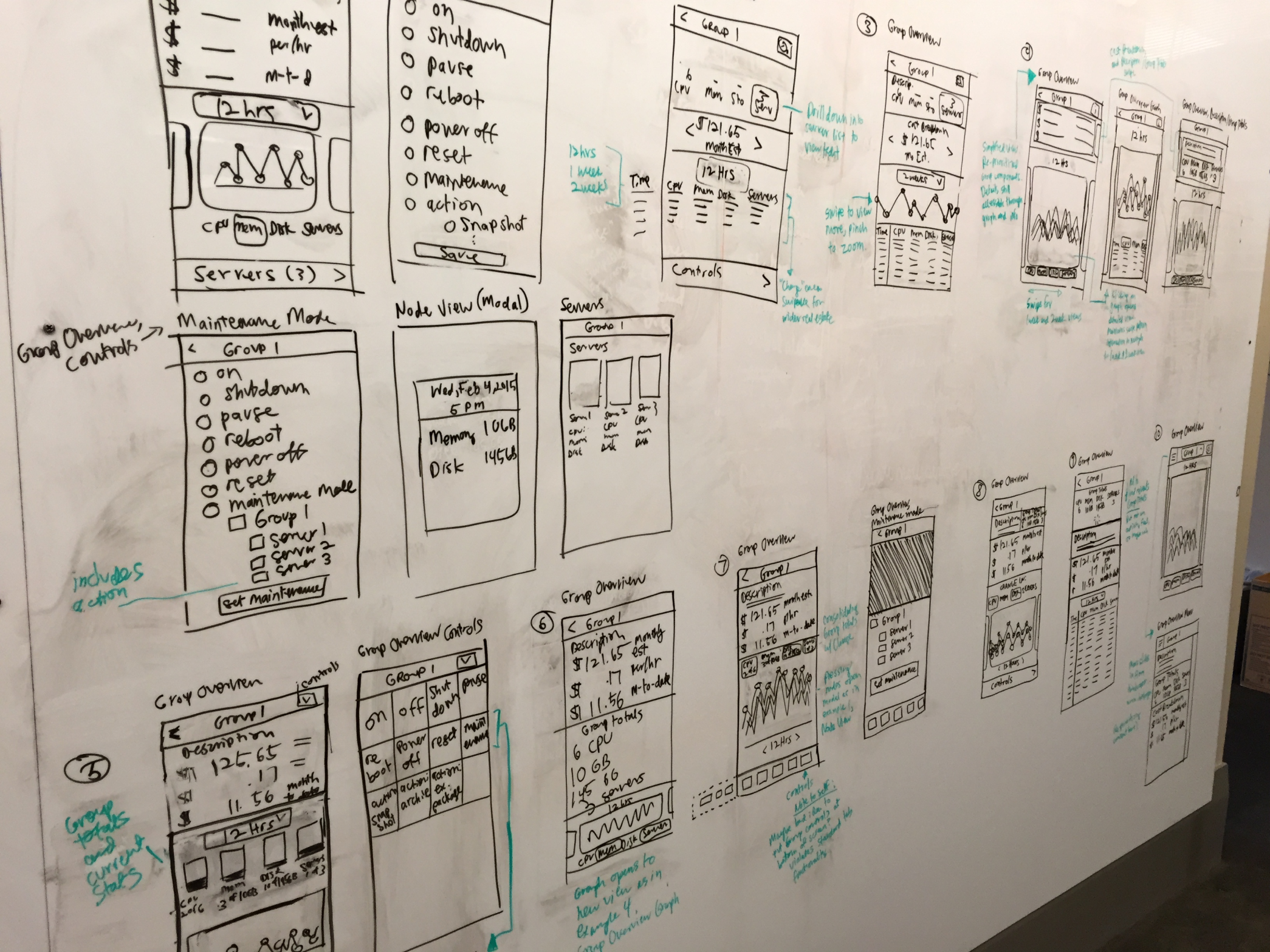
With a clearer understanding of the pain points and cloud management ecosystem, I worked independently visualizing main task flows that addressed customer concerns.

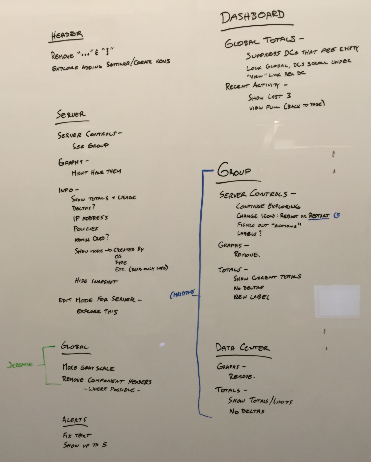
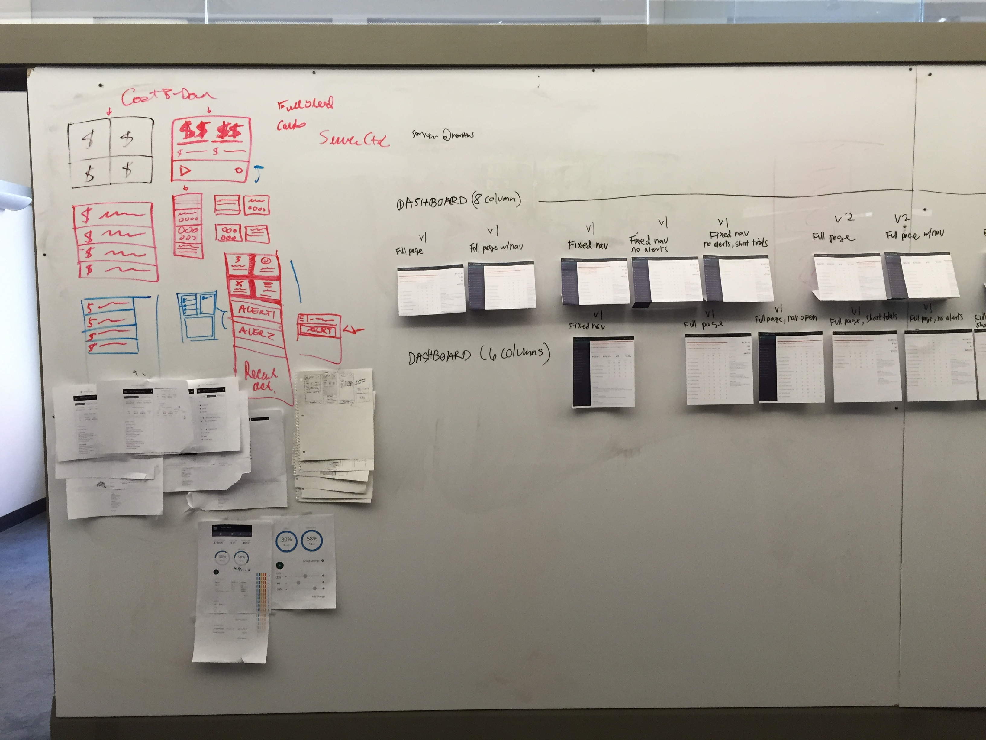
Receiving feedback
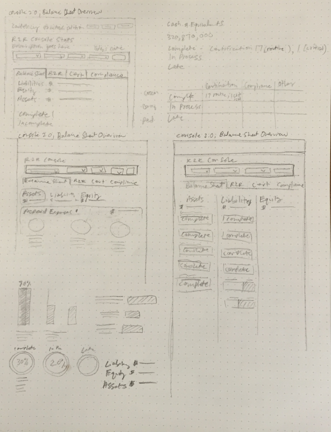
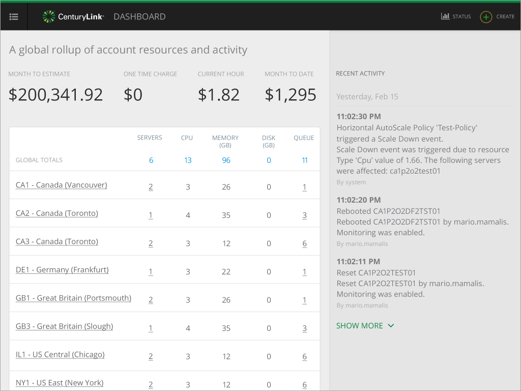
The main feedback I received centered on re-examining the type of data I was surfacing. This meant making sure I was displaying meaningful and contextual info at the right time and in the right place.
For mobile environments especially, I didn’t need to capture the entire CPU and Memory resource history from the last month. Instead, I optimized the display to communicate what customer really wanted to know – the current status. This also freed up more real estate and simplified the screen so learners could get a better at-a-glance view.


Collaboration
We cycled through layout, display, and UI iterations collaboratively. Since we did not have a budget for user research and testing, we leaned on best practices, feedback from other designers in the company, and were in lock-step with stakeholders. This meant routine whiteboard presentations and feedback cycles to ensure alignment. My colleagues were a big source of support and feedback.
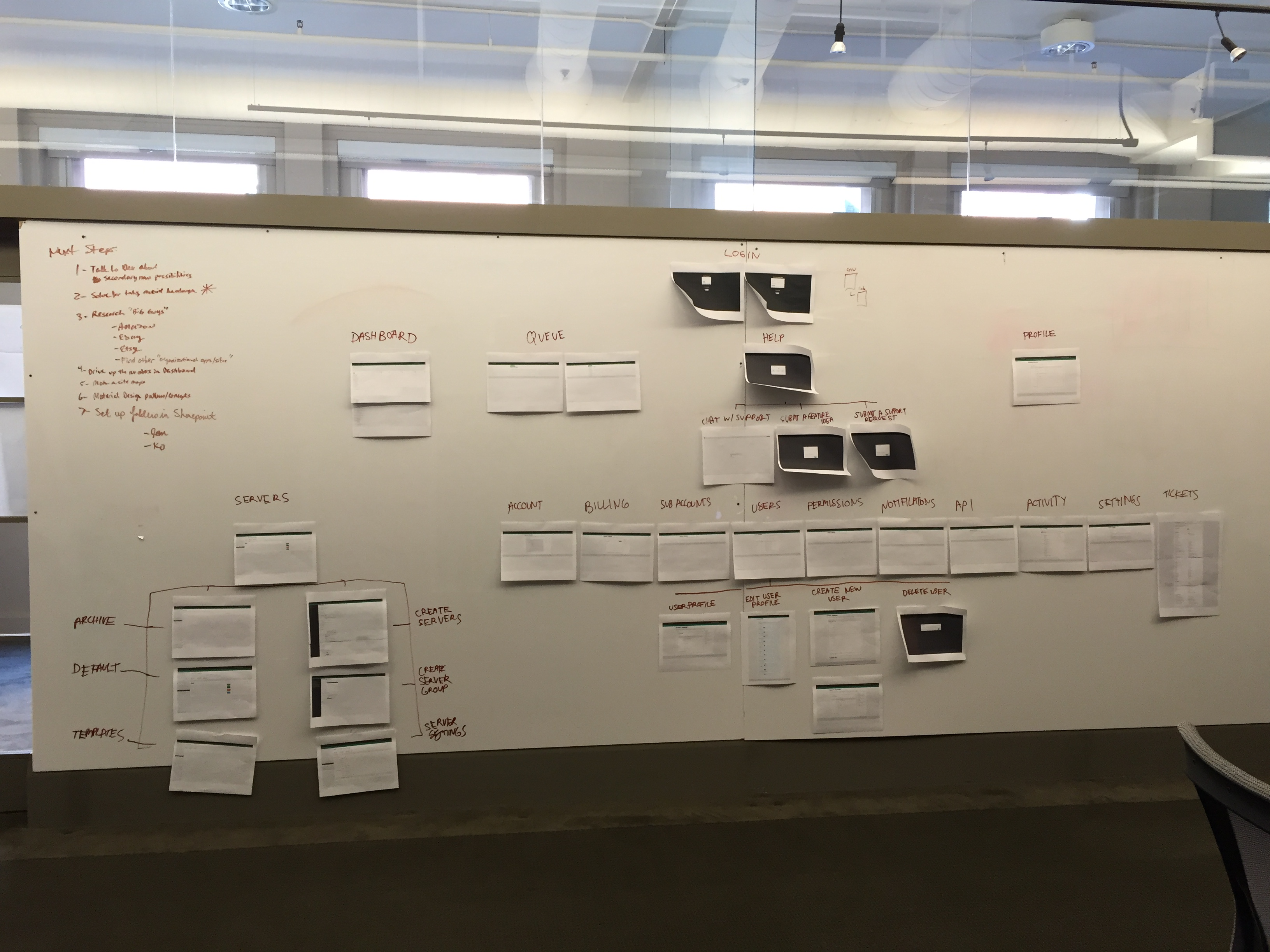
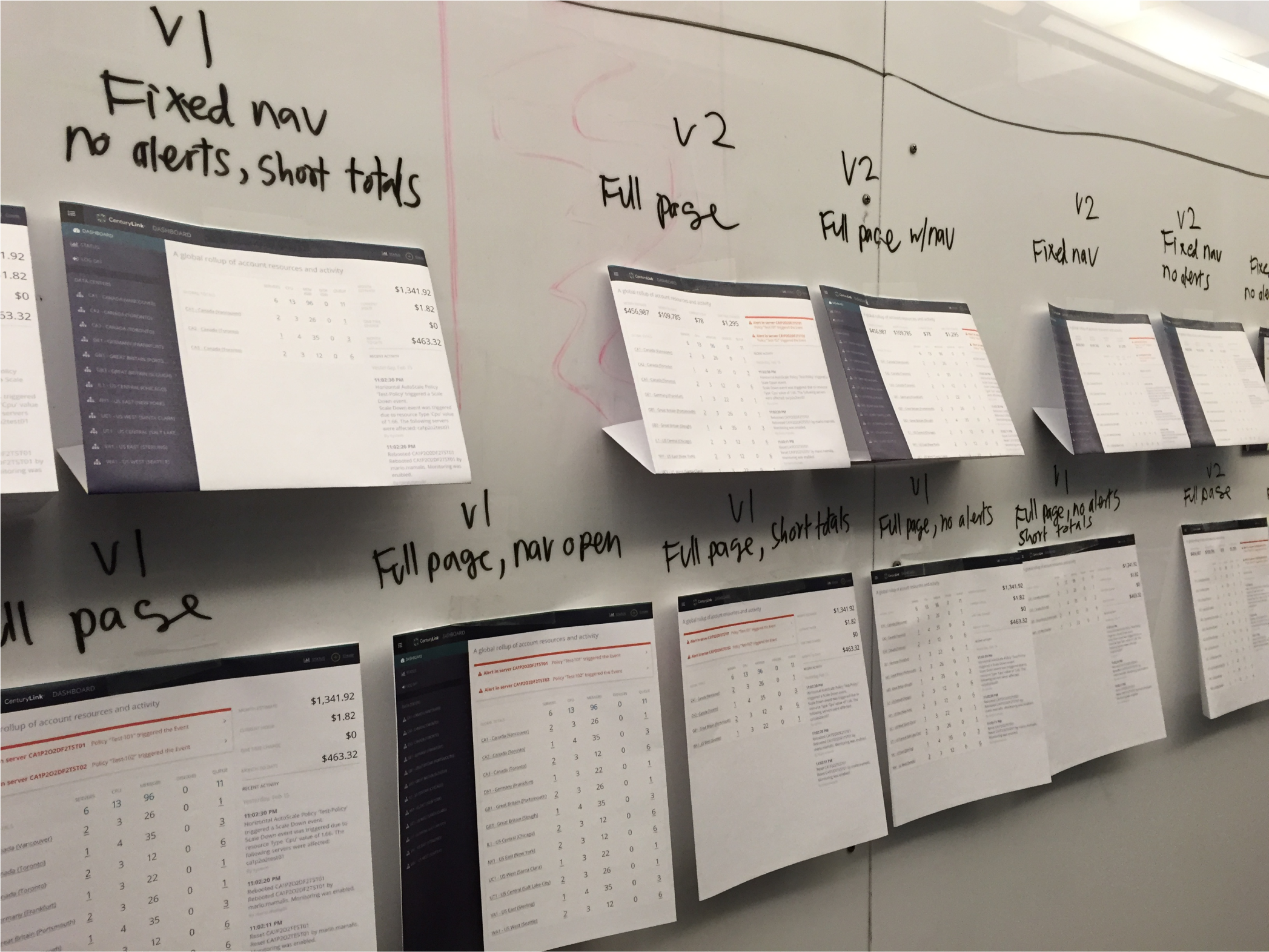


Scaling navigation
One of the notable challenges of this project was scaling multi-tiered mobile navigation. The web portal handles navigation by exposing all nested server groups and individual servers with each data center. The challenge was how to optimize this experience on mobile without compromising on design or functionality.
Competitive analysis
I did competitive analysis on how companies like Target, Walmart, and Fred Meyers tackled mobile, multi-tier navigation. This mental model informed the framework I used to shorten the navigation path so learners were always one step away from parent levels.

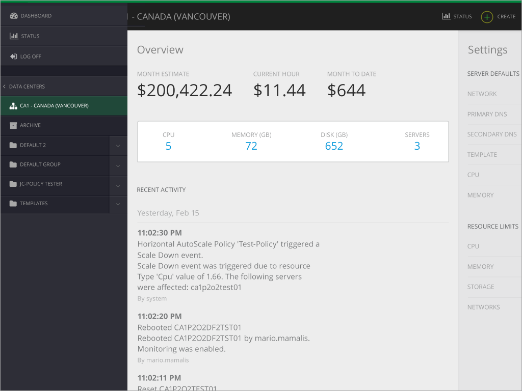
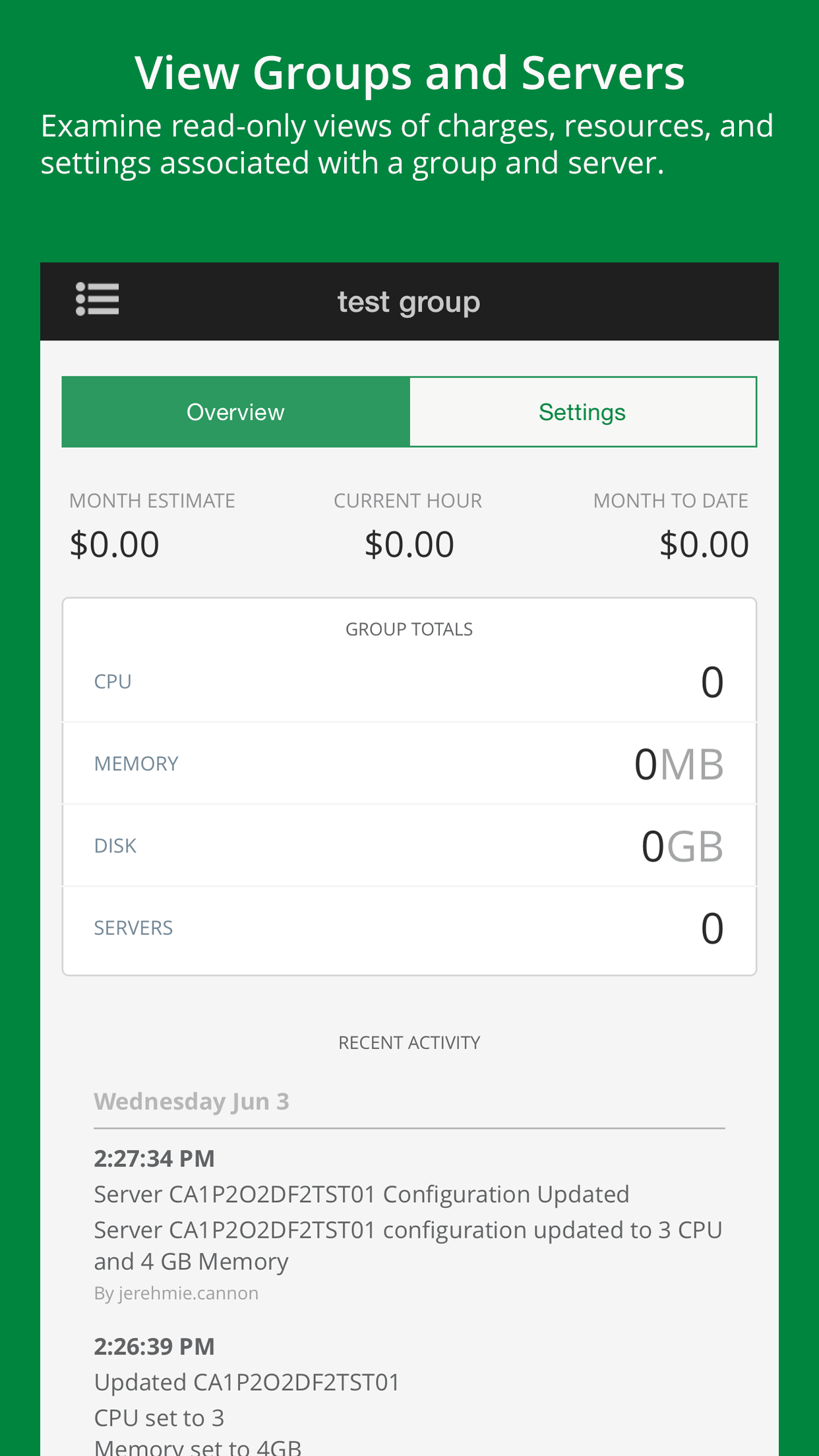
Data center list 
Data center 
Server group 
Sub group 
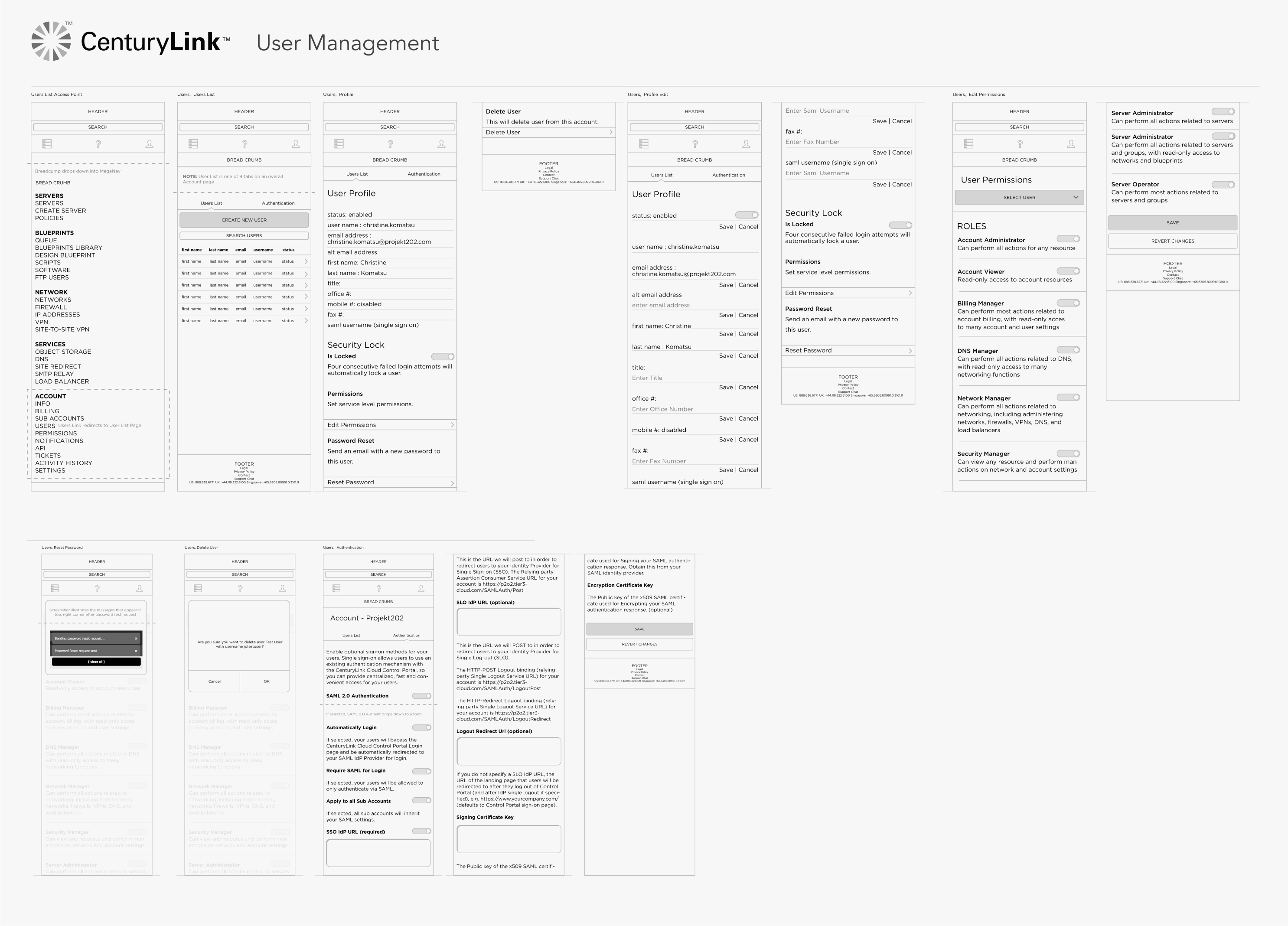
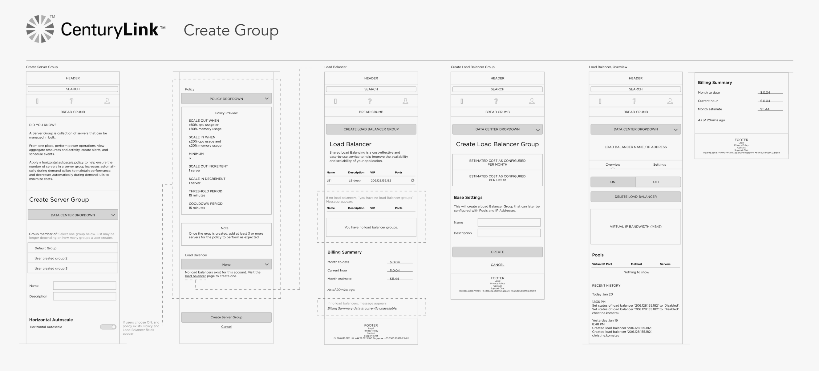
Delivering assets
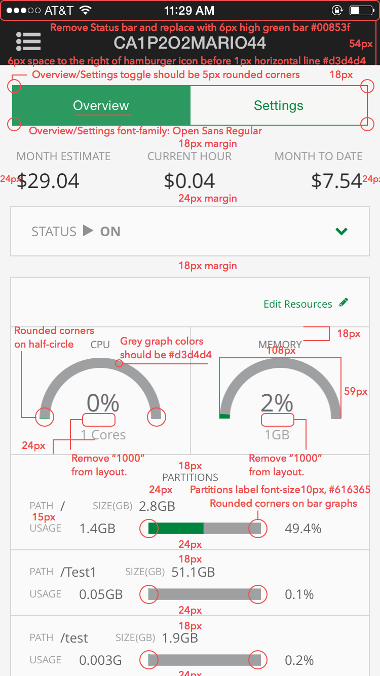
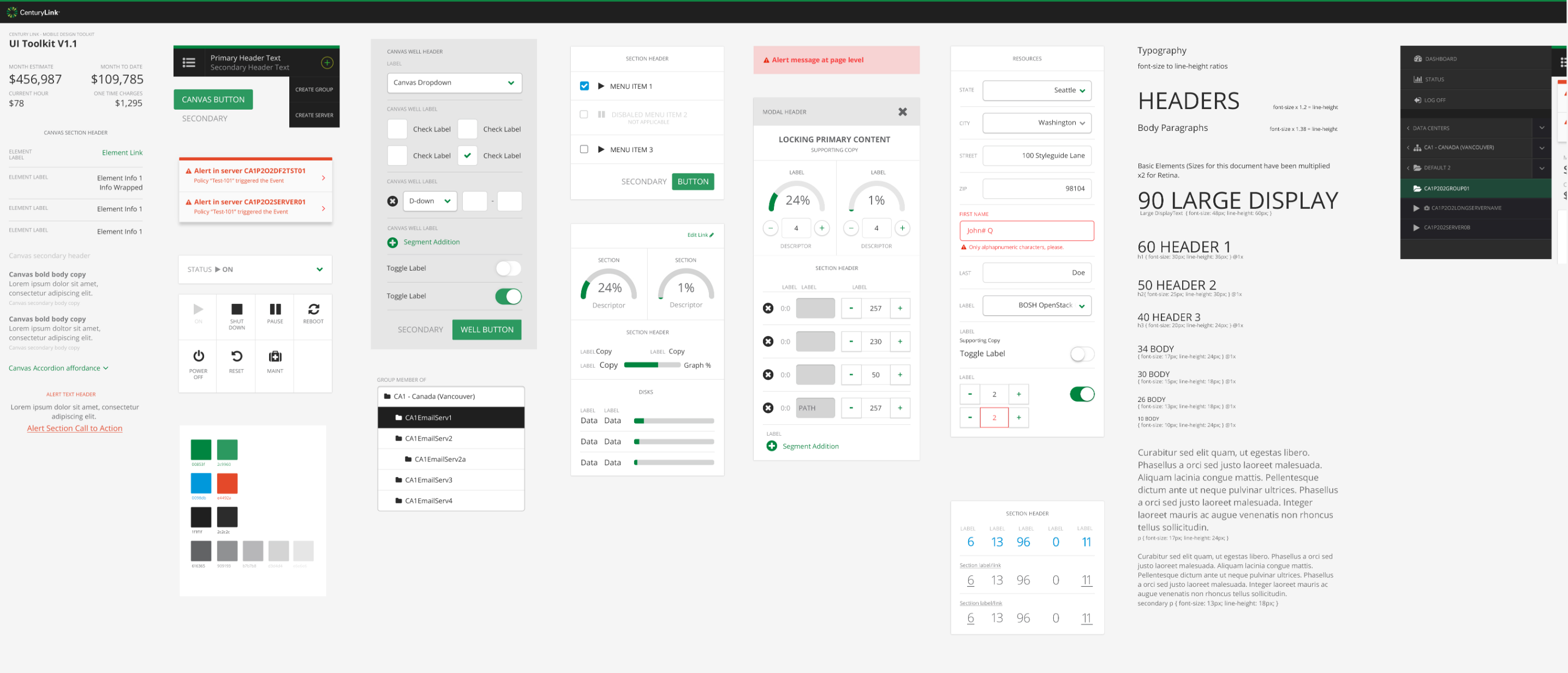
I created detailed redlines for developers to ensure accurate UI (before access to Figma/Sketch).


Final designs


Lessons learned
Check feasibility early and often
One of the challenges in our team dynamic was lack of communication between design and developers. Assumptions were made about functionality from both sides that ended up causing hiccups near development. In future projects, I worked closer with developers by including them in all stages of the design process including user research and in early working sessions to better align on expectations. I also learned to create interactive prototypes to help reinforce functionality.
Push for validation testing
If I could do it over again, I’d push for a Steve Krug* style usability test, using three customers and asking them task-oriented questions to understand how well our designs met user needs, surfaced usability problems, and validated content prioritization.
*Steve Krug is a usability consultant who wrote a couple books I’ve found really helpful when it comes to usability/validation testing: